 |
| Scratchbox, a film by Keith Mullins. John Sedlack, DP |
Thursday, February 18, 2016
Today's work
An initial pass through some footage from Keith Mullin's film Scratchbox (which I also gaffed). Getting ready to teach a workshop in Advanced DaVinci Resolve on Saturday at Austin Movie Gear.

Thursday, February 11, 2016
Cinematography Rant by Noam Kroll
Noam Kroll pops up on my news feed on Facebook now and then and I always like what he writes. He doesn't drown you in technical details or arguments about gear. He talks about the principles behind the work. Like this one:
Cinematography Rant: Why All DPs Need To Understand Color Correction
I
first started learning the art of color correction for one simple
reason - I
needed to give my DSLR footage more production value by emulating the
look of higher end cinema cameras.
It
wasn’t long after I started learning the craft that I realized just
how much value color can add to any project, and how crucial it is
for all filmmakers to understand color.
Monday, January 25, 2016
Environmental Color Casts: Fix It With Luminance and Saturation Tools
Here's a shot from a short I worked on.
We shot with a 7D in a rented motel room using a couple of 1K's
through diffusion for sunlight. The lights were gelled for daylight
and we balanced for that. As you can see, the color of the walls
themselves skewed the balance of the shot very warm with no way to
balance it out while shooting without adversely affecting skin tones.

It's not awful. In a little indie short
it might even be acceptable to many viewers. But the shot is nearly
monochrome and lacks any counterbalance to the overall warmth. As
we'll see, even the shadows are saturated with orange.
I'm going to show you how to get from that first state to this, in just a few simple steps.
I'm going to show you how to get from that first state to this, in just a few simple steps.

The second version is much more
sophisticated and cinematic. It cuts the orange, limits it to the
walls and allows for cool shadows that round out the color profile.
Here's a direct comparison.

And you don't have to stand on your
head to do it. Here's how I did: first, I used the Gamma Primary
Wheel in Resolve to bring up the values in the mid tones just a
little bit.

You can see the change in the scopes
below – subtle, but significant in that it sets us up for the
grading to come after.


The second step is a little more
complicated. I'm going to use a new node to do 3 simple things that
add up to a big change:
- First, I'm going to make a selection of the lower values (Zone 4 and below)
- Second, I'll desaturate those values considerably but not completely. Default saturation value in Resolve is 50 – I'll take them down to 35. This will not completely eliminate the warm bleed from the walls but will considerably reduce it.
- Third, I'll use the Gamma Primary Wheel to shift the color in the lower zones towards blue/green.
- Important note: I am using the Primary Wheels because of the tonal overlap of the controls, which blends the grade without creating noticeable edges. I'll also soften it in the HSL selection itself.
I'm going to make my selection using
only the Luminance Tool in the HSL Color Selection Menu. You'll see
in the screenshot that I have turned off the Hue and
Saturation selection tools so that I am selecting only by Luminance.

For my specific selection I am going to
use the forehead of the man on the right. I want only that tone and
darker. I don't want to select any values lighter than that tone.

Returning to this screenshot again,
you'll see I have also both extended the selection all the way to
full black (the Low value is at 0.0) and, just as importantly I have
used the High Soft control to soften the selection (H. Soft is a
15.6). That ensures no hard boundaries between what is selected and
the rest of the frame.

Using Shift-H I can see my mask in my
viewer window. Everything not 'grayed out' is selected. You can
clearly see the subtlety of the selection being feathered with the
High Soft tool.

Now I'll move on to the next step and
drop the Saturation to 35 from 50 in my selection. Then I'll go back
to the Gamma Wheel in the Primary Wheels menu and shift the color
towards blue/green – just a little bit.
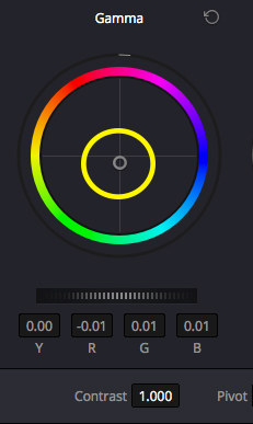
Checking our work, we see that all the
heavy lifting is already done.

We're not completely done yet, though.
Looking carefully at the shadows to the left of the man on the bed we
see they are still very saturated and warm. To fix that, we'll go to
the Curves Menu in a new node. On the right of the Curves dialogue
there's a dropdown menu with the 'Versus' menus.

These options give you curve controls
with very specific options. 'Lum Vs Sat', for example, allows us to
select a range of tones by their luminance and drop the saturation,
like this:

I've taken the lowest range of tones
and completely desaturated them, completely removing any remaining
color cast. If you look closely at the headboard of the bed behind
the man's back, you'll see the change like this:

This gives us a much cleaner look, with
no uncontrolled color or color where we don't want it. This is often
done as part of creating a 'cinematic' look in a grade – the tricky
part is deciding where in the sequence you want this to happen. Early
in a grade it allows you a clean slate for added color, later in a
grade like this it brings in the dimension of 'clean' blacks.
I'm also going to sharpen the whole image up just a little. The camera settings were for 0 Sharpening – I'd rather control sharpening in the grade than try to work with footage sharpened in camera. For that, we go to the misleadingly labeled 'Blur' tool in Resolve. When the values in the Blur Radius Tool are increased (raised) the image is blurred. When reduced, the image is sharpened:
I'm also going to sharpen the whole image up just a little. The camera settings were for 0 Sharpening – I'd rather control sharpening in the grade than try to work with footage sharpened in camera. For that, we go to the misleadingly labeled 'Blur' tool in Resolve. When the values in the Blur Radius Tool are increased (raised) the image is blurred. When reduced, the image is sharpened:

Finally, I'm going to bring down the
pillows on the left just a little bit. I am a bit obsessive about the
edges of static frames. I don't want anything on the edges that is
going to lead a viewer's eye out of the frame or away from the focus
of the narrative. Those pillows are just a little too hot. To do this
I'll use a Power Window.

You can see that shape creates the
perfect curve on the left side of the frame to isolate the highlights
on the left without affecting anything else. All we have to do is
invert the selection:

and use the Gain Control on the Primary
Wheels menu to bring the gain down and little bit, and we're done.

Happy Grading!
When Color Matters

"Color is slippery. Anyone who has ever tried to translate a casually observed color into pigment on canvas knows that the hue will never be the same as what he or she remembers. Variables like light and shadow change the same basic color from warm to cool, light to dark. And, as Albers taught us, chromatic context is also a critical factor. The lively exhibition, "Color Matters," at The Painting Center, comprises paintings by thirteen artists for whom the exploration of color's transience is a driving force."
Some great stuff reviewed in this article.
Thursday, December 31, 2015
Crushing Blacks Precisely - LOG and Curves in Resolve

The Zone System is a method of precisely identifying levels on the value scale from 0 (pure black) to 10 (pure white). It was created by two photographers, Ansel Adams and Fred Archer, around 1939 or 1940 as a tool that would allow them to ‘previsualize’ a final printed image before even exposing film.
As a photography student many years ago learning to work with B/W film, it was the single most important tool I had in my conceptual arsenal. With that, I could make monochrome do anything. Without it, it was hit or miss. Mostly miss.
We’re going to use the Zone System, Curves and the LOG Menu to look at ‘crushing blacks’, a common term in film referring to depth of detail in shadow and the exact point at which detail falls off into an inky, detail-less void.

Often, blacks are ‘crushed’ with what seems to be a large, blunt instrument. It doesn’t have to be that way. Resolve gives a colorist a great deal of control over lower values. For example, looking at the chart at the beginning of this post, where - exactly - do we want to lose detail? Should we crush Zone 1 into Zone 0? Or should we go farther and crush Zone 2 down to Zone 0? Should we maintain an appreciable difference between Zone 2 and Zone 3? Or do we crush Zone 3 into Zone 2 and everything below that down to 0?
Any of those decisions will have an impact on your film, how it feels, how it affects the sense of light. In the still above from Inside Llewen Davis, everything below Zone 3 is crushed into Zone 0, while still maintaining separation through the middle zones and a very high key outside the window. It’s an achievement.

Any of those decisions will have an impact on your film, how it feels, how it affects the sense of light. In the still above from Inside Llewen Davis, everything below Zone 3 is crushed into Zone 0, while still maintaining separation through the middle zones and a very high key outside the window. It’s an achievement.

How is this done?
As an example, I’m going to use this frame from a friends’ short film. It’s a similar scene to the Llewen Davis shot.


The first thing I’m going to do is bring the saturation down to 0, so we are only looking at the tonal values.


In the Primary Wheels menu I’ll use the Gamma Wheel to push the values as far towards the middle of my waveform as I can without losing detail.


__________________________
Stretching out the middle tones
My next step is to use the Lift Wheel to drop the shadows. You’ll see immediately that the main effect of these manipulations is to stretch out the midtones in the image, like rolling out a pie crust.


Now we're beginning to see some differentiation in the the very lowest values - Zones 0 - 3.

Here’s how it looks with saturation back up to normal, just for reference.

__________________________
Primary Wheels
A brief tangent is required at this point. Until now, we have been working in the Primary Wheels menu - the 'default' color manipulation menu in Resolve. The Primary Wheels controls have an important characteristic which make them ideal for global manipulations - their 'jurisdictions' overlap each other to a very large degree. Because a change to the 'Lift' (lower values) overlaps the 'Gamma' (midtone values) range and even somewhat into the 'Gain' (higher values) range, it means that changes are smooth and blended. For most global changes (like those we have made so far), that's exactly what we want.
This illustration shows how the Primary Wheels tools work:

But the Primary Wheels tools are not the only tools for manipulating color and tone in Resolve and several of the others are quite different. At this point in on this shot we need more precise tools, which are available in Resolve in Curves and in the LOG menu.
[There are others, too, but we'll leave those for another day ...]
Let's say that our objective in working with this specific frame is to separate the lower values and get both rich black and tonal separation in the black T Shirt of the man facing us. We want that shirt to be as pretty as we can make it. Let's look at how we might do that using Curves.
__________________________
Y (Luminosity) Curves
The Curves menu looks like this:

By default, the YRGB curves are all active and linked when the Curves menu is selected. By clicking either one of the YRGB buttons at the upper right or the Anchor Icon to the left of them, however, they can be individually selected.
We want the Y Curve. This curve represents the 'Luminosity' channel and changes only tonality/contrast. This is a very important tool in Resolve because with it, the colorist can change global or local contrast relationships without increasing color saturation. We're going to add points on the curve and change contrast in the lower end of the value scale to bring out the folds in the black T Shirt.

Overall we have deepened the black of the shirt but through the single point raised above the curve we are separating the tones of the folds to make them stand out.


Although it is possible, as shown, to target very specific tonal ranges using Curves, we're still constrained somewhat by the curve itself. Notice that not only were the very lowest ranges affected by the change but so also were others. Curves give you more control than the Primary Wheels, but still not precisely targeted controls.
__________________________
LOG Menu
Let's look at the LOG menu.

Although it looks very similar to the Primary Wheels menu, instead of LGG (Lift, Gamma, Gain), the LOG menu has Shadow, Midtone and Highlight. It’s not just the labels that are different, they operate in a very different way, as shown by the following illustration:

The Log menu tools have very little overlap, so it’s possible to control Shadows with very little effect on Midtones or Highlights. Let’s return to our last waveform:
We have now stretched out the value range so there is clear separation between the lower values of the waveform (corresponding, roughly, to Zones 0 - 3). We'll use the LOG Menu to work with those precisely. My next move will be to use the Shadow control in the LOG menu to drop the lowest values in the waveform to pure black. You’ll note that there is very little change in the overall waveform, only the dropping of the lowest values.


Here’s how it looks with saturation back up to normal:

__________________________
Final Tweaks
Although we now have good values in the lowest blacks, and clear separation in the lower Zones, the image still seems a little washed out so we'll return to the Primary Wheels menu, taking advantage of the smoothly blended changes, and tweak it a little bit.


With normal saturation:

Compared to our ungraded image, you’ll see we were able to bring in a full tonal scale - crushing only the blacks we wanted to take to full black - without sacrificing any shadow detail or making the image oppressively dark.
Original, ungraded image:

Original, ungraded image:
Happy Grading!
Subscribe to:
Posts (Atom)